


QQQ and Volume Tell the Story
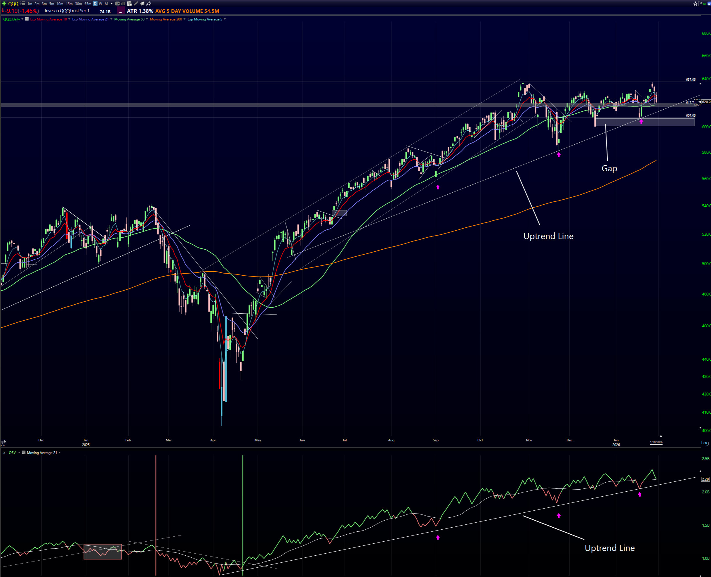
The first chart shows the Nasdaq 100 ETF, QQQ, in the top panel and On Balance Volume, or OBV, in the lower panel. Over the past four months, the index has largely moved sideways, chopping around and consolidating after a strong advance earlier in the year. This type of price action often precedes a larger move, making this an important area to focus on. Together, these two charts help determine whether this consolidation is a pause within an uptrend or the early stages of a breakdown.
In the top panel, QQQ remains in an uptrend that has been in place since last spring. That uptrend line has been clearly defined and respected, and it is one of the key levels I am watching. I have also highlighted a shaded support zone created by the gap lower in December. This gap represents an important area of demand. As long as price remains above both the uptrend line and this gap, the longer-term bullish structure remains intact.
The lower panel shows OBV, a cumulative volume indicator that helps determine whether money is flowing into or out of the market. I have noted how OBV provided an early warning ahead of the February 2025 correction by breaking its uptrend line before QQQ peaked. Currently, OBV is still holding above its own uptrend line. I have highlighted three separate occasions (with pink arrows) where OBV touched this trendline and then turned higher, and each of those instances coincided with advances in QQQ. These touches are marked with pink arrows on both the OBV and QQQ charts. One point of caution is that each of those bounces has been weaker than the one before, which suggests momentum has been fading.
From a bullish perspective, a strong bounce in OBV at its uptrend line, combined with a decisive advance in QQQ to new all-time highs, would be a powerful confirmation that the uptrend is resuming. That outcome would be very bullish for the market in the near-term.
On the other hand, a breakdown below the uptrend lines in both QQQ and OBV would be bearish. If that move is followed by QQQ falling below the December gap support, it would signal that the market is transitioning into a more defensive phase and that downside risk has increased meaningfully. These are the levels I am watching closely, as they will determine whether I remain heavily invested in equities or shift toward a more defensive allocation.
Risk-On Leadership Is Narrowing
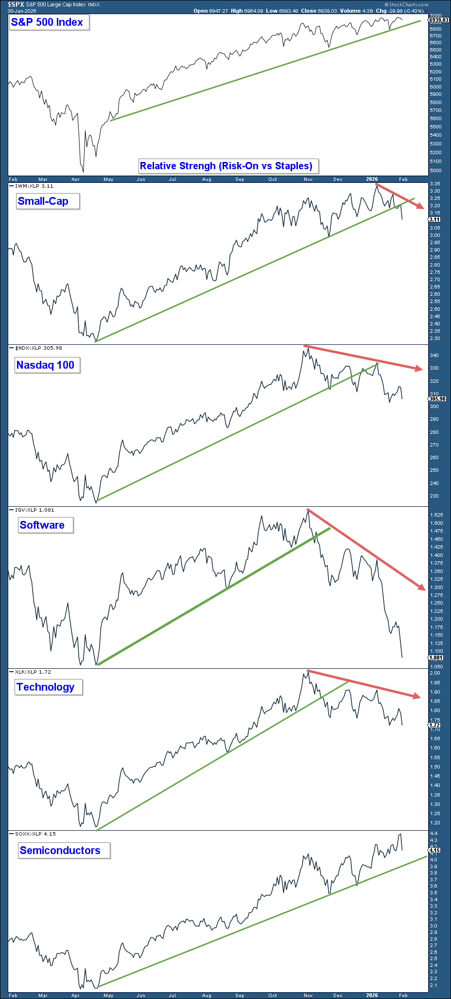
The second chart looks at market leadership and helps determine whether investors are taking on risk or becoming more defensive. In the top panel is the S&P 500 index, which remains above its longer-term uptrend line shown by the green line. This confirms that, on the surface, the broader market trend is still positive.
The lower panels show relative strength comparisons between several risk-on areas of the market and the defensive Consumer Staples sector, XLP. These include Small Caps, the Nasdaq 100, Software, Technology, and Semiconductors. Relative strength moving higher means investors are favoring risk-on assets, while relative weakness suggests a shift toward safety.
What stands out on this chart is that leadership has narrowed considerably. Small Caps, represented by IWM, showed strong outperformance earlier, but topped out near the beginning of the year. Since then, IWM has developed a short-term negative divergence and, with last week’s market decline, broke below its relative strength uptrend line. The Nasdaq 100, Software, and Technology also topped out in early November 2025 and have since broken below their respective relative strength trendlines.
This means that four of the five risk-on groups being monitored have now broken their uptrend lines. This tells me that the market has been progressively shifting toward a more risk-off environment beneath the surface while the broader indexes have consolidated over the past four months. The widespread breakdown across most risk-on areas is a meaningful warning sign and suggests that the risk of the market breaking below the key support levels discussed earlier is elevated.
Semiconductors, SOXX, remain the lone exception. As long as this group continues to hold above its relative strength uptrend, it leaves open the possibility that the broader market consolidation resolves higher. However, continued weakness across the other risk-on groups would further increase the odds of a broader market breakdown.
Bitcoin To Flash an Early Warning Sign
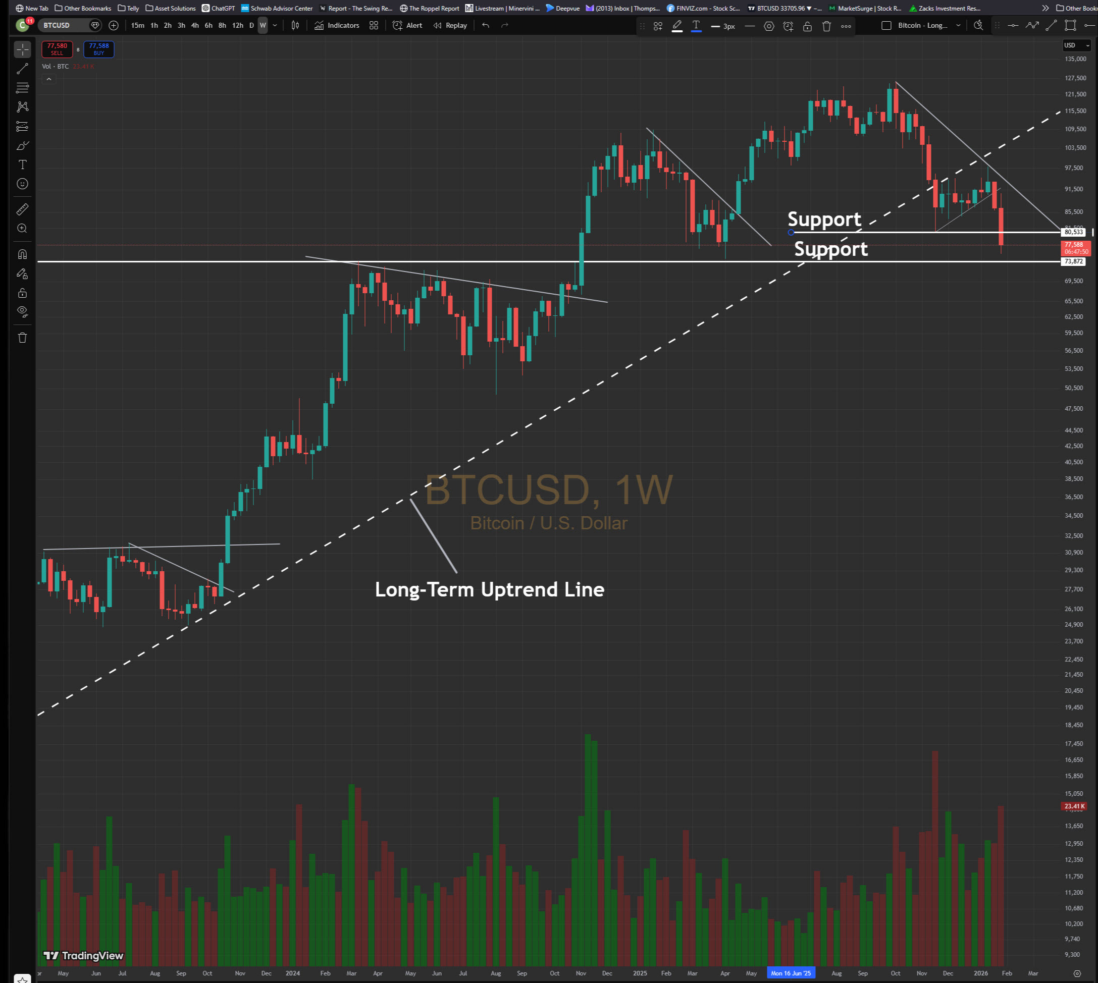
The final chart looks at Bitcoin, which I have referenced in recent newsletters as an important risk-on indicator. Historically, Bitcoin has often turned lower ahead of the stock market during major market tops, making it a useful tool for identifying increasing risk beneath the surface.
This chart focuses on the past couple of years and highlights Bitcoin’s long-term uptrend line. That uptrend has now been broken to the downside, which is an important change in character. In addition, I have marked two key support levels. The first support level has already been violated. The second level, which sits just below current prices, represents the neckline of a potential head-and-shoulders topping pattern.
A decisive break below this second support level would be very bearish for Bitcoin. If that were to occur alongside a breakdown in QQQ and a violation of the OBV uptrend line discussed earlier, it would provide strong confirmation that the stock market is entering a correction of some type. While Bitcoin weakness alone does not guarantee a stock market decline, it has historically served as an early warning sign when risk appetite begins to fade.
This is another chart I am watching closely. Continued weakness in Bitcoin would add weight to the cautionary signals we are seeing elsewhere, while stabilization or a recovery would signal that downside risk in the broader market is abating.
Summary
At this point, determining market direction and how to allocate capital is fairly straightforward. If QQQ breaks below the key support areas and trendlines highlighted on the QQQ and OBV chart, that would be my signal to become more short-term defensive. If those breaks occur alongside continued Bitcoin weakness, a sustained risk-off environment, and a breakdown in the semiconductor group, that combination would strongly suggest that the market is going to fall in the short term.
On the other hand, if those key support levels hold, OBV stabilizes, Bitcoin finds support, and risk-on leadership reasserts itself, the bullish trend remains intact. In that scenario, the message from the market would be to stay invested and allow the longer-term uptrend to continue working.
Client Account Update
Client portfolios are positioned with a clear plan tied directly to the technical levels outlined above. If those lines in the sand are violated, I will reallocate more defensively. That would include reducing equity exposure, potentially reallocating some capital into more defensive areas such as consumer staples, healthcare, and possibly energy, which is beginning to show early signs of strength. I would also look to raise cash and or use index hedges to help protect against additional downside risk.
On the other hand, if the market resolves in the opposite direction and those key support levels hold, I will maintain our fully invested equity posture and continue to participate in the longer-term uptrend.